

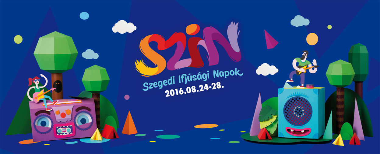
„Festival Identity by Hand in Paper.”
The SZIN Festival was first organized in 1968, and after a short period of intermission it restarted in 2003. The Festival soon became one of the best festivals in Hungary. The organizers of the summer - closing festival thought that it was high time to re - design the identity but they wanted to keep the colourful nature of the festival. Our purpose was to create a visual material that meets the standards of international and Hungarian festivals; to make the new identity unique and easy to recognize.
From the first step till the last
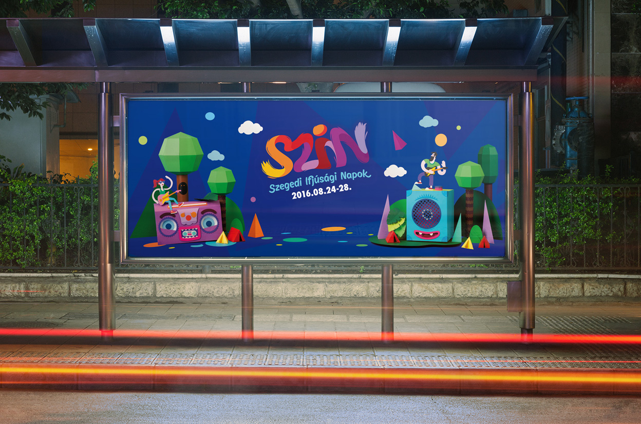
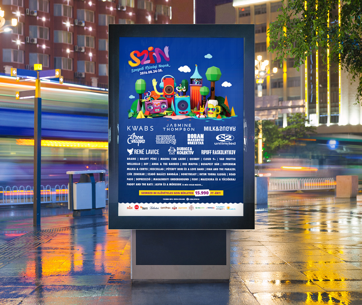
We created a concept, which doesn’t only work and prevail on an online platform, but looks great on promotional products as well. It was important to come up with something that is variable and can be built easily even at the festival. We also kept in mind that the original concept should be upgradeable any time. Our concept originated from the Hungarian word "szín" (which means colour) and from the name of the festival as a pun; after all, the event offers plenty of diversified programmes and concerts.

When we re - planned our designs, we started with a full color logo which we shaped from energetic, hand - drawn images. The lively colors in the logo are enhanced by the ultramarine background, making the text vibrant. It is complemented by the white, bold texts and the paper - built composition we created with colors reflecting those appearing in the logo.


We like setting new challenges for ourselves from time to time. This is why we decided to step out of the computer graphics’ platform and create real - life materials for this project. As the first step, we designed the images on computer and then we started to build everything by hand in paper. In the process of designing and implementation we asked for Juci Szécsi’s kind help, who had created several compositions in paper before.


In constructing the figures, we used up more, than 50 m2 colored papers in several different shades, 10 rolls of double - sided tape, and about 200 hours, plus we eroded numerous cutters. It was amazing to see the world made up of our little paper - creatures coming to life.


Firstly, we prepared several compositions of the items in our studio; then we shot some photos of them; and finally, using the materials, we prepared the heart of the festival-design.

We re - designed the website as well: so that it would fit the recent trends. We used modern design with clear elements, creating efficient communication. It was an important aspect to highlight the up - to - date news, the lineup and the purchase of the tickets. We designed the page to be responsive, so that it would appear perfectly on every platform.


TOP
LIKED WHAT YOU SEE? SHARE IT!
Neeed to engage your audience through graphic & web, photo & video?
Meet us for a brainstorming or drop an email so we can get to know
You and Your next Project.
You and Your next Project.