

„Let consumers become part of your team!”
The founders of the InsightLab had all worked for international firms before: each of them was an employee at one of the top 10 market research companies in the world. After long years of experience - gathering, they decided to start their own business, as they believe in the power of consumer knowledge: it has been their philosophy since then. Their goal is to provide a complex service that can be expected at the highest levels, still doing it in a customized way. This is what makes them unique. Their qualities are accountability, accuracy, creativity and flexibility. They aim at making their clients part of their team - which is the key to their success.

From the first step till the last
As a fresh business, it was important for the team to have a unique, recognizable appearance, which is easy to remember. Their theory about design was that it should reflect the company’s philosophy, the complexity of their service, the power and vitality of a young team, combined with their professionalism and customer - based attitude. This is the idea they wanted to demonstrate, so we tried our best to deliver the message to the customers and competitors.
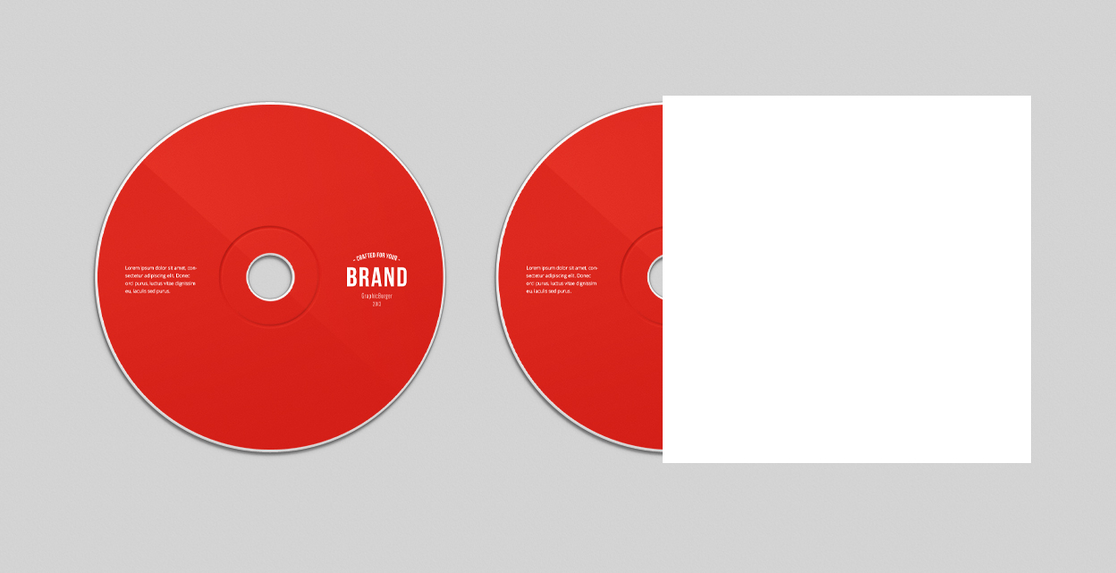
It is a well - known fact that a logo has an outstanding role in mediating between a company and its clients: it is the most efficient tool in spreading their message to the customers and competitors. It is important that the creation of the logo is not only a task on the to - do list: it is the alpha and the omega of the company’s identity. It must be exciting, easy - to - remember, it needs to grab attention and characterize the company. The typeface we used is basically a classic one; it is contrasted by the red speech bubble, and the font change inside the logo; the text as a whole implies professionalism. The InsightLab logo’s colors are powerful, noticeable: the red color does not only break the grey and black colors, but also provides intensity to the design. The specialty of the logo is that it is curved and angular at the same time: implying friendliness and dynamics, while expressing stability and reliability.


The slogan of the company - Let consumers become part of your team! - is the most important message they wish to communicate - their logo and design both reflect it. As the founders of the company find it important to make their clients part of their marketing team, we created the Customer character, which is built up of icons representing the areas of market research done by the company; emphasizing their philosophy. These areas are the commercial-, banking-, financial-, telecommunication-, energy-, and the pharmacy sector – among several others.


Result
This project was especially challenging for our team, as we had to prepare an identity for a brand new company. Additionally, it had to reflect the complexity of their services, the competence of the team, and their willingness to cooperate with their customers in an even tighter way than ever before.
TOP
LIKED WHAT YOU SEE? SHARE IT!
Neeed to engage your audience through graphic & web, photo & video?
Meet us for a brainstorming or drop an email so we can get to know
You and Your next Project.
You and Your next Project.